Timor Leste Covid-19 status comparison
Timor Leste
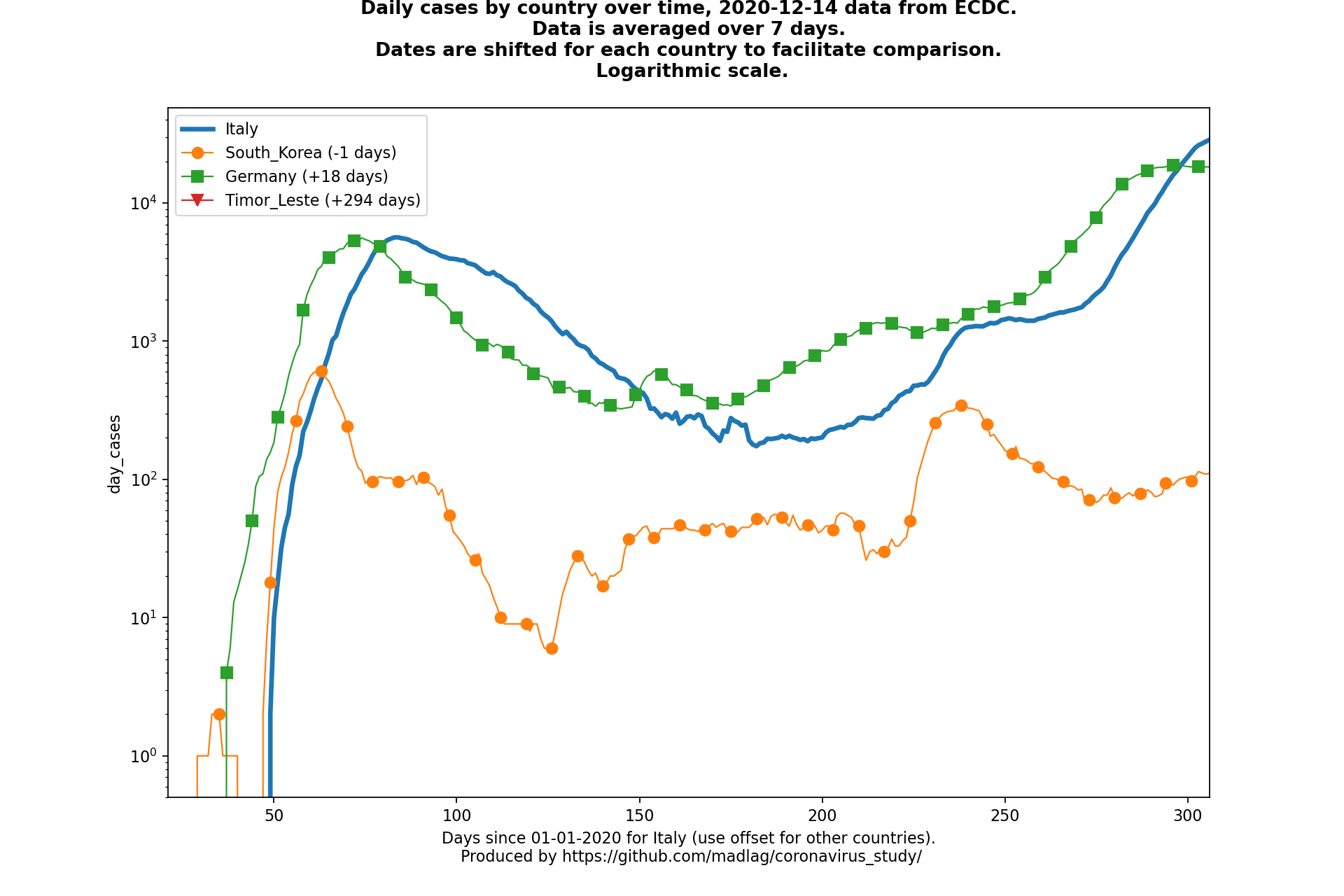
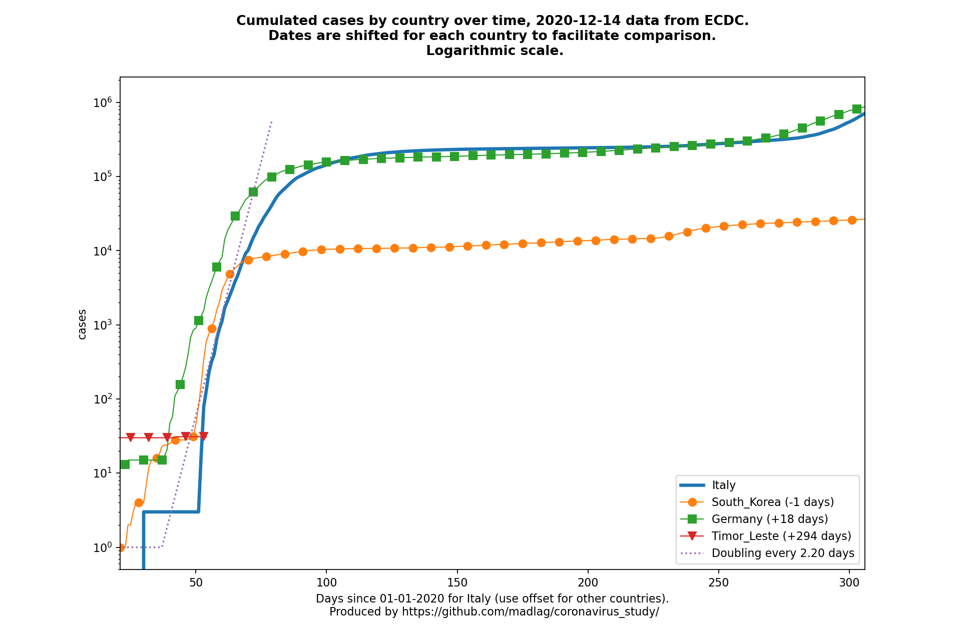
Be careful, all those charts use a logarithmic scale, because it’s the best way to analyze how the epidemic is evolving.
The horizontal position of the different countries is adjusted to have the same fix number of deaths at the position in the graph, for comparison purposes.
The vertical position of the different curves is of course impacted too.
“Cases” charts are even more affected too because they use the same time offset that is used for “deaths”.
The most important thing to look at in those charts is the slope of the curve : the steeper the curve, the shorter the “cases” and “deaths” doubling time.
Feel free to use these charts to raise awareness about the danger Covid-19 represents.
Cases over time
Daily cases (static)

Cumulated cases (static)
